Case study
A job posting site redesign which increased conversions by 154%

The challenge:
The job posting site Jobangels.com asked us to increase the number of job applicants for positions listed on their site. The problem was they couldn’t change the copy of the ads. Still, they wanted to see whether changing just the user interface, specifically its visual elements, could help.
The approach:
We dove deep into the mindset of a job seeker to see which little tweaks incorporated directly into the webpage could serve as effective nudges. We addressed differences between sexes, (the fact that women are more loss averse than men) and then looked at specific spots where introducing some visual information might be beneficial.
Want to receive actionable insight each month?
Subscribe NOWThe solution:
We tested several behavioral interventions directly on the webpage. Each addressed a specific mental shortcut.
Social proof
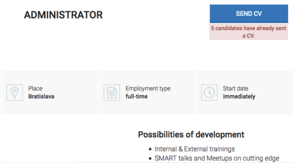
In moments of uncertainty, we tend to look at what others have done in a similar situation. This is known as social proof. We added a banner to show the job seekers how many people had already applied for the job in order to increase the attractiveness of a specific posting. Seeing that the position was in demand encouraged more people to also apply.

Risk aversion
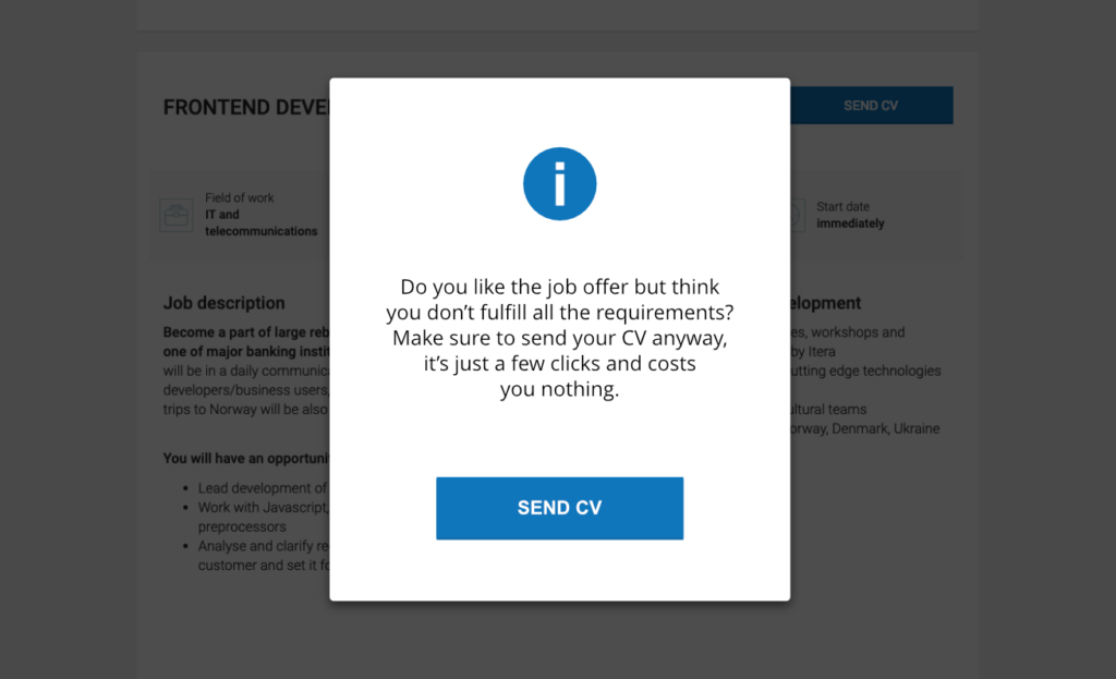
On average, men feel confident enough to send a CV if they fulfill 60% of the requirements of a job. For women, it’s almost 100%. That could result in nearly half of the prospective applicants not sending in a CV! We addressed concerns about not being qualified enough through a pop-up window.
Perceived effort
To further encourage action, the copy of the pop-up pointed out how easy it was to send a CV, with the aim of making the action itself feel like a no-brainer.

Timing
Prompting prospective applicants at the right moment was crucial. In this case, the encouragement came when they scrolled down to the candidate requirements section and the website noticed they wanted to leave and provided a timely nudge.
The results
We A/B tested several versions over the course of several weeks. Adding social proof increased conversions by 138%. Combining the interventions was even more impactful, increasing the likelihood a person would send their CV by 154%.
How can you apply it?
- Understand uncertainties. Make sure you get to know your audience’s concerns. What are the barriers that might put them off? Make sure you address these uncertainties in your design or copy.
- Add social proof to win over hearts (and minds). Think of ways to insert social proof even in places where it might seem counterintuitive. In this case, seeing other people compete for the job encouraged more to apply, despite intuition suggesting it would be the other way around.
- Think of the right timing. If a pop-up window had appeared when visitors first opened the posting, it could have led them to close it right away due to banner blindness. But when it popped up at an opportune time, they actually read it.
