Case study
Tax filing made simple: an online funnel redesign
The challenge
If you ask any freelancer or small business owner what a bureaucratic hell looks like, they’ll likely say: tax filing in March.
The process is complex, unclear, and stressful. People spend hours filling in forms they don’t fully understand and still aren’t sure if they did it right.
Numiron’s goal was to remove this pain and allow users to file their tax return online — with expert review and optional submission handled for them.
In short: take the process people hate, and turn it into something manageable — maybe even pleasant.
The approach
Our main goal was to make the heavy and technical process feel more human.
We wanted users to feel like they were sitting at a bank branch, talking to a friendly employee. Someone who patiently guides them, explains everything in plain language, and makes them feel safe and confident throughout the process.
At the same time, the process had to feel smooth and simple enough to finish.
At every step, users needed to clearly understand:
- what we are asking them,
- which documents we need,
- and where they can find those documents.
Any uncertainty could easily lead to frustration, or abandonment.
The solution
Making the funnel more human
People are not evolutionarily designed to fill in forms. They are designed to communicate using human language.
So to make the funnel feel more human, we introduced Nina.
Nina isn’t an AI or a chatbot. She’s a simple avatar — a photo of a friendly assistant who welcomes the user from the first screen and guides them through the entire process.

Nina introduces herself at the beginning of the tax form
We leveraged the effect of social presence. By using a human avatar, we made the experience feel more personal — as if someone was really “there”, which strengthens engagement and customer satisfaction. The goal was for users to feel guided by a real person, not a cold interface.
That’s why Nina speaks in a conversational, simple way. She explains things clearly, adds context, and turns a bureaucratic task into something that feels closer to a normal human conversation.
Reducing perceived effort
One of the biggest barriers was perceived effort — not how complex tax filing really is, but how complex it feels at first glance. When a process looks overwhelming, users won’t even start.
Originally, Numiron presented all income types on one screen with multiple checkboxes. Selecting one revealed more questions underneath. With several levels expanding on a single screen, the interface quickly became cluttered and daunting.
Before:
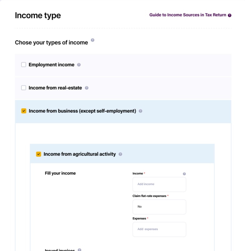
After:

Users also saw information that wasn’t yet relevant. A live tax overview showed how the amount changed with every input.
This increased the pain of paying — the discomfort people feel when they constantly see costs rise. In some cases, it could even push users to adjust their inputs just to lower the number they were seeing.

Tax overview in the side panel
Users also saw the option to request a tax deferral — even when it didn’t apply to them. We moved it to the beginning and showed it again at the end only when it was relevant based on the user’s data.
To make the process feel simple, we decluttered each screen. In the side panel, we kept only what helped: a short video guide and access to support.
We also applied chunking. Whenever possible, Nina asks only one question per screen and focuses on a single action. We separated each income type onto its own screen, so users could focus on one thing at a time.
Removing uncertainty
Even a small moment of uncertainty can cause users to drop out.
In every step, users needed to clearly understand what we were asking. But short field labels alone were not always enough.
We added tooltips with plain-language explanations and examples. If we asked for a document, we explained where to find it.
What are receivables?
)These are amounts owed to you. Enter the total value of invoices you’ve issued but haven’t been paid yet
The goal was simple: users should never have to guess.
Upselling paid features
Users could file a tax return through Numiron even without a paid plan. The paid plan allowed them to manage their entire business — issuing invoices, connecting their bank account, and syncing transactions.
This helped during tax filing: it synced insurance payments automatically, matched transactions with invoices, and reduced manual input. To put it simply – everything was faster.
We introduced these benefits before the process started, and again at key moments — like when users manually entered insurance payments. Nina explained that with the plan, this step would be automatic.
The results
The redesigned funnel is currently being rolled out.
We’ll have measurable results after the tax filing deadline, when the first users complete the process. We’ll then track completion rates, drop-offs, and user feedback.