Case study
A 15% conversion increase at TJ Legal website

The challenge:
Slovak citizens and entrepreneurs working abroad have the right to claim tax rebates from their foreign employer. However, the process can be quite complicated. TJ Legal aimed to provide workers with consultations and simplify the rebate process for them.
They approached us with a quite straightforward task – to help them improve their website conversions. That basically meant bringing more people to the online contact form.
The approach:
To make the most out of TJ Legal’s potential, we conducted an extensive analysis of the website and the email with instructions which was sent after completing the online form. More specifically, we focused on 3 main areas:
- UX
- Copywriting
- Principles of consumer psychology and behavioral economics.
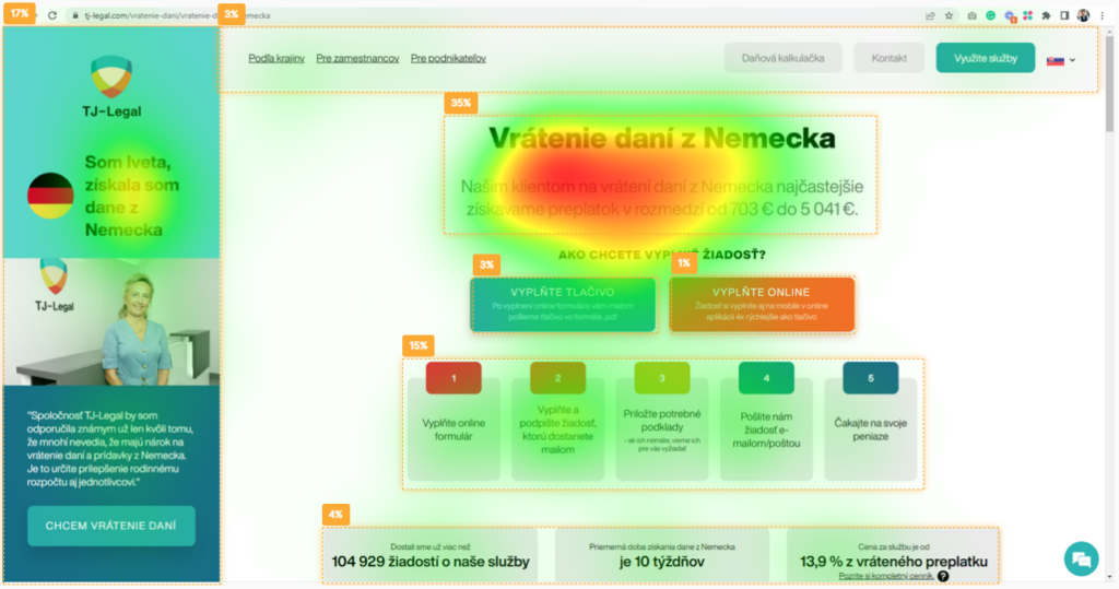
We also used the Predict AI tool. It’s an online tool that allowed us to scan the website and obtain heat maps of where the users’ attention went in the first seconds of their visits. In this way, we were able to see whether the right elements were attracting the most attention.
The solution:
After the analysis, we summarized the main findings and suggested improvements. Here’s a glimpse of the recommendations in all three main areas:
1. UX
The goal of the webpage was to direct the users to the online form. However, the way the elements were arranged on the page did not serve this purpose well.
For example, there were six calls to action and the most important one drew just 1% of customers’ attention. What is more, the color palette used on the webpage caused the buttons to blend in.
The shortfalls were basically the same in the online form itself. It made both the webpage and the form hard to follow, decreasing the chance of a conversion.
We suggested decolorizing elements that were not that important and making the buttons more salient to attract attention. Also, we recommended reducing the number of CTAs to just two main buttons. The main CTA – to fill out the form online, should be the more dominant one.
2.Copywriting
Making buttons clear:
The main issue was with the copy in the buttons. It didn’t describe any action, so it was not clear what was going to happen once users clicked them. They also included subheadings, which made them too long.
Our suggestion was to shorten and change the copy, so it was clear where the button led. But that was not the only copy we suggested making shorter.
Shortening FAQs:
Even if the FAQs provided useful information, they were simply too long. Studies suggest that in cases like this, long and hard-to-read text implies that the action (in this case asking for rebates) will be hard as well.
Shortening the answers and dividing them into bullet points thus not only made the text easier to read, but also made the action seem easier to do.
3.Psychology
Among many psychological principles that we suggested implementing, reducing uncertainty was the main one. Uncertainty is the main barrier the customer may face. Even the slightest doubt can cause them to leave the site.
Using a testimonial to eliminate uncertainty
We began with a testimonial on the landing page. It drew the most attention – over 20% – but at the time customers saw it, they didn’t yet know what the product was about. This was a potential source of uncertainty.
This drawback could easily be turned into an advantage. We suggested placing the testimonial in a less prominent place to draw a bit less attention and using it to eliminate customers’ doubts.
Asking for registration later in the process
Another barrier was the prompt for registration. Even before users had started filling out the form, they were asked for their email address. There was no explanation of the benefits of the registration, which could leave users with many questions.
We recommended asking for registration later in the process and adding reasons why users should do it. Once the users had already put time and effort into filling out the form, they would be much more likely to register.
The results
After implementing all our suggestions, we A/B tested the webpage with the original one. As the goal was to bring more users to online forms, we looked at the click rate for the button leading to the online form.
The results showed a 15% increase when compared to the original version. TJ Legal then decided to implement our suggestions in the rest of its online services portfolio.
What can you take away from this?
- Landing pages need to be easy to navigate. Users need to know instantly what the page is about and where the buttons lead. Once they need to put more effort into understanding the product, the chance they will leave increases.
- Easy to read means easy to do. Try to simplify your copy and make it as short as possible. Customers need quick information. The harder it is to extract it from the text, the harder it will seem to convert.
- Uncertainty is the main conversion killer. A single doubt may lead users away. Try to find out what your customers’ main uncertainties are and eliminate them as early in the process as possible.